Shinrin
Brand Identity
Project scope: visual identity, packaging, branded merchandise, promotional video
Shinrin* is a chain of tea houses located in the center of Kyoto, Japan's cultural and educational capital. The owners envisioned a reimagined and modernized take on japanese culture for their brand so that it can be calm and inviting towards their target audience - university students and remote workers who could use the tea houses as quiet spaces to work at, and tourists who want to experience Japan's thousand-year-old craft of tea brewing.
*Shinrin is a fictitious brand

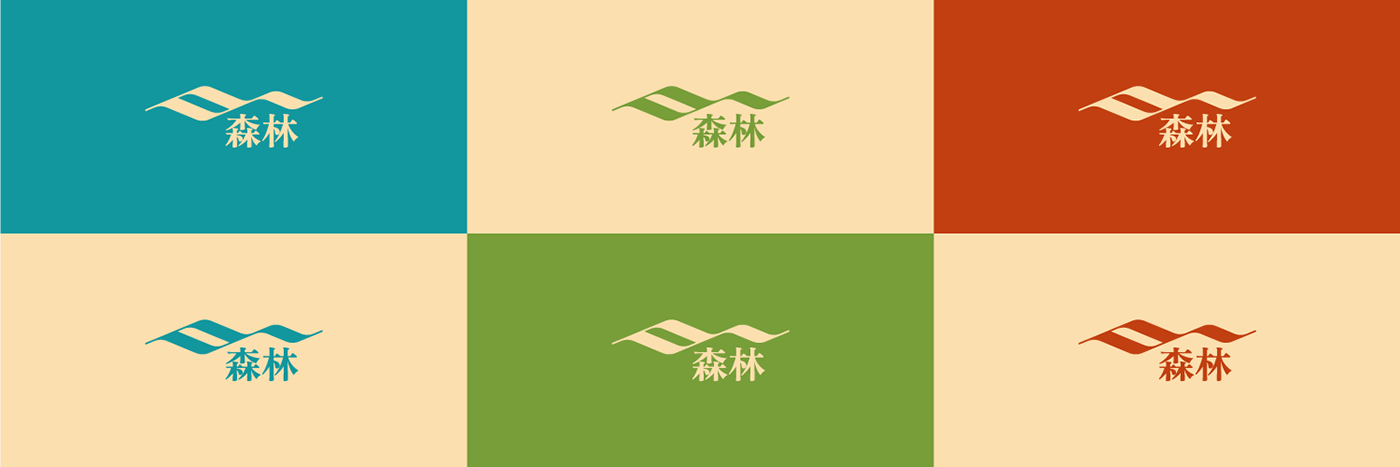
Inspired by Japan's infamous calligraphy, Kyoto's cultural heritage and nature, a minimalistic logo was created. As a modern tribute to ancient customs, two brushstrokes blend together to form a subtle abstract combination of tea fields and traditional architecture.


Color System
The colors of traditional japanese painting were flipped to achieve a more youthful feel with the saturated greens, reds and blues.

Pattern
The logomark predisposes a seamless repeating motif that resembles traditional patterns.

Application
Tied together, the brand elements form a consistent and visually memorable system.


Thank you!


